Thinking about myself and trying to create something.
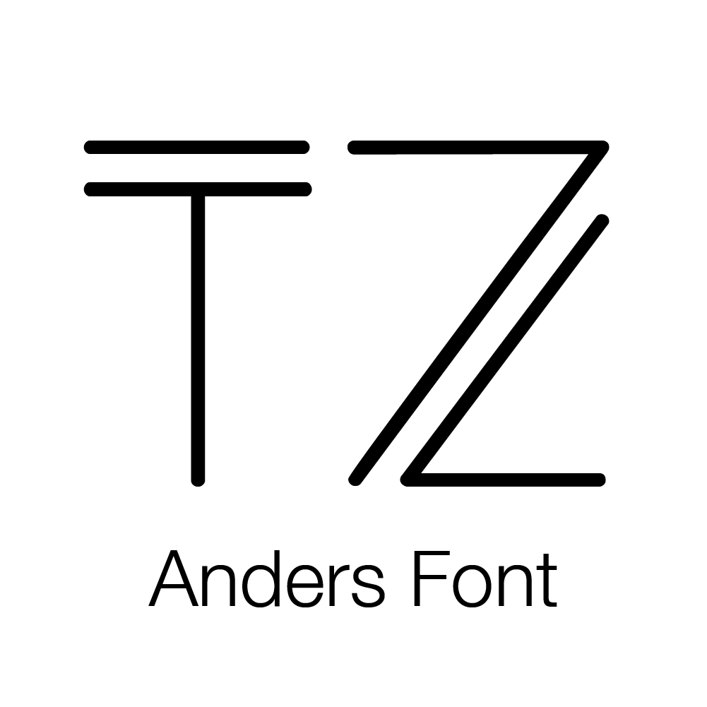
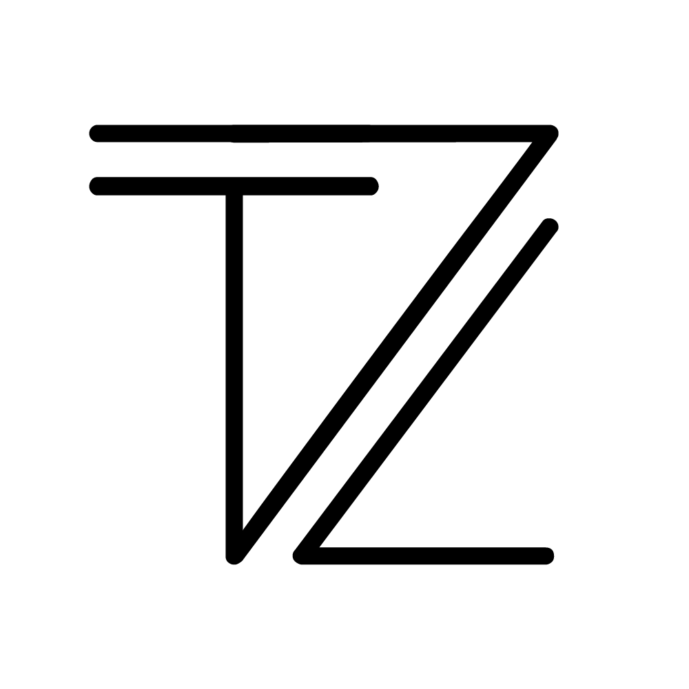
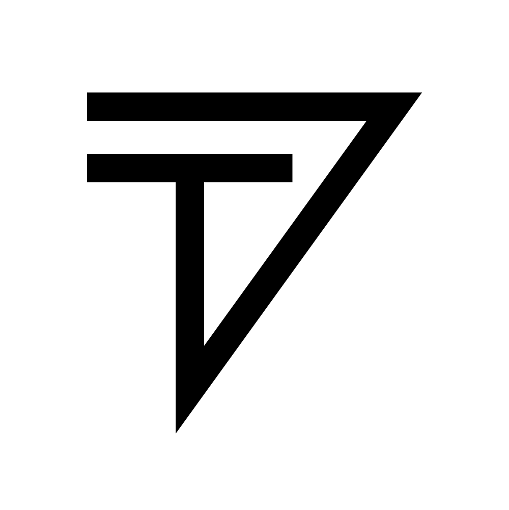
I float in between right and left brain so I wanted something that represented that idea. The logo I created is based on the shape of my initials. These are sharp lines and feel boxy, so I wanted to make something with angles that wasn't obviously TZ and was unsymmetrical. After looking at layering the letters together I saw this weird shape forming. The "T" is obvious but the "Z" has to be imagined. I continued to iterate on it and match angles on the logo until I was happy with it. I will continue to update it as I get better at graphic design.

Authentic and Quirky.
This website should give anyone looking at it a good idea of who I am. It has all of the professional elements it needs and also some humor, e.g. the fun page and the testimonials page. I enjoyed building this site and I wanted to reflect that with a clean look but also bright gradients.